

Let's Call It Constructive
The fact that stocks pulled back a bit last week shouldn't have come as a surprise to anyone. The S&P 500 had enjoyed an historic joyride to the upside in a very short period of time. As in +19.2% in just 10 weeks.
Along the way, stocks became overbought and sentiment got a little too optimistic. Everybody could recite the bull narrative... The Fed is now on hold (and perhaps even thinking about returning to an accommodative stance later this year) and the Trump trade deal will fix the global #GrowthSlowing woes.
So, with key resistance overhead and some disappointment on the news front, it wasn't exactly a shock to see a break in the action.
Speaking of the news, there were five headlines that caught my eye last week and, at least in my opinion, might have contributed to the red bars on the charts.
But first we need to set the stage. Coming into last week, it was clear that momentum had slowed. The S&P had spent the prior week moving sideways and flirting with a breakout of the key resistance zone in the 2815 area. And since the bulls had been able to break on through to the other side of the all-important 200-day moving average the week before that, it seemed it was only a matter of time until the bulls would be testing the old highs again.
At the beginning of last week, there was an awful lot of talk about a "Goldilocks economy" here in the good 'ol USofA. As in the economy wasn't too hot (to cause inflation and the Fed to get back to work), wasn't too cold (to cause a recession) but was "just right" (for corporate profits to grow at a strong enough rate for stocks to continue to rise at 8-10% per year). Party on, Wayne!
But a funny thing happened on the way to the run for the border. That's right; it didn't happen. Nope. Instead, the #GrowthSlowing theme may have gained some traction.
First there was the ECB "pivot." This time it was Mario Draghi's turn to surprise investors as the ECB acknowledged the slowdown in economic activity by cutting the central bank's forecast for growth in the Eurozone in 2019 from 1.7% to 1.1% and by offering up a new cheap loan program designed to encourage lending.
Next there was talk of "peak employment." Mark Zandi, Chief Economist at Moody's Analytics, provided us with this sound bite, which reminded everyone that the economic cycle is clearly getting a little long in the tooth.
We also heard from the Fed's Lael Brainard, who acknowledged that slowing growth has caused a major change in her outlook.
And when it came time to revel in the economy's robust jobs market, the bulls bonked. While analysts had expected the monthly report on Nonfarm Payrolls to show a gain of 180,000, the Bureau of Labor said the economy created just 20,000 jobs last month. Ouch.
Sure, there were lots of "yea, buts" to go along with the jobs report and my guess is that the numbers will likely be revised higher. But the bottom line is that 20K vs. 180K was a pretty big miss and effectively put a spotlight on the idea that growth might indeed be slowing - even here in the U.S.
Oh, and as for the imminent trade deal, you know, the deal that is expected to return the world's economies to growth and prosperity, that didn't happen either.
So, stocks did what one might have expected them to do. They pulled back a bit. And so far at least, the decline in the stock indices has been orderly as a fair amount of intraday dip-buying was on display last week. Friday was a perfect example of said action as the S&P closed almost 1% off the low of the day.
From my seat, the action thus far has been "constructive" and is more indicative of a pause than the start of a meaningful decline. My guess is this is the dip that many had been praying for a few weeks ago. As such, it will be interesting to see if the bears have anything left in the tank next week or if the underinvested souls that have missed out on the best start to a new year in ages continue to #BTD.
Weekly Market Model Review
Now let's turn to the weekly review of my favorite indicators and market models...
The State of the Big-Picture Market Models
I like to start each week with a review of the state of my favorite big-picture market models, which are designed to help me determine which team is in control of the primary trend.
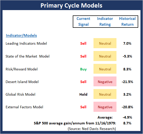
View My Favorite Market Models Online
The Bottom Line:
- The good news is there was some modest improvement in the "Primary Cycle" board again this week. However, as I've been saying, the overall "state" of the board suggests that everything may not be as rosy as the recent joyride to the upside (to the tune of 20% from the Xmas Eve low) might suggest. And given the fact that #GrowthSlowing was recognized by the ECB this week, the market may be in for a "reality check."
This week's mean percentage score of my 6 favorite models improved to 47.9% from 45.4% last week (Last 2,3,& 4 weeks: 40.3%, 44.2%, 48.9%) while the median upticked again to 50.0% from 46.3% last week (Last 2,3,& 4 weeks: 42.5%, 40%,46.7%).
The State of the Trend
Once I've reviewed the big picture, I then turn to the "state of the trend." These indicators are designed to give us a feel for the overall health of the current short- and intermediate-term trend models.
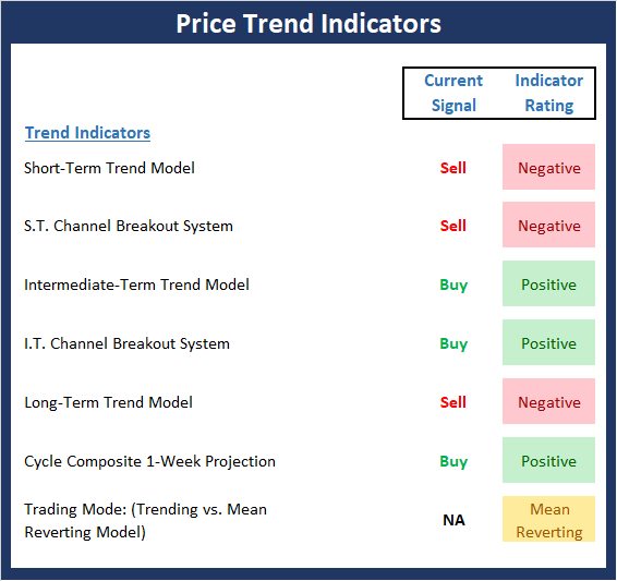
View Trend Indicator Board Online
The Bottom Line:
- Given the recent overbought condition, it was not surprising to see the indices pull back a bit last week. Many might even label the move as being "long overdue." So far at least, the move has been orderly. And despite the S&P's break below its 200-day, the type of extreme volatility we saw in December has not been evident.
The State of Internal Momentum
Next up are the momentum indicators, which are designed to tell us whether there is any "oomph" behind the current trend.
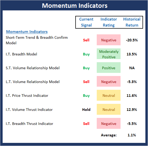
View Momentum Indicator Board Online
The Bottom Line:
- The Momentum board definitely took a hit this week as 3 new sell signals flashed this week. As such, we need to recognize that the recent strong momentum has clearly waned. But this is to be expected during pullbacks. And as we've been saying, the extremely strong readings seen in the momentum arena suggest that this remains a buy-the-dip environment.
The State of the "Trade"
We also focus each week on the "early warning" board, which is designed to indicate when traders might start to "go the other way" -- for a trade.
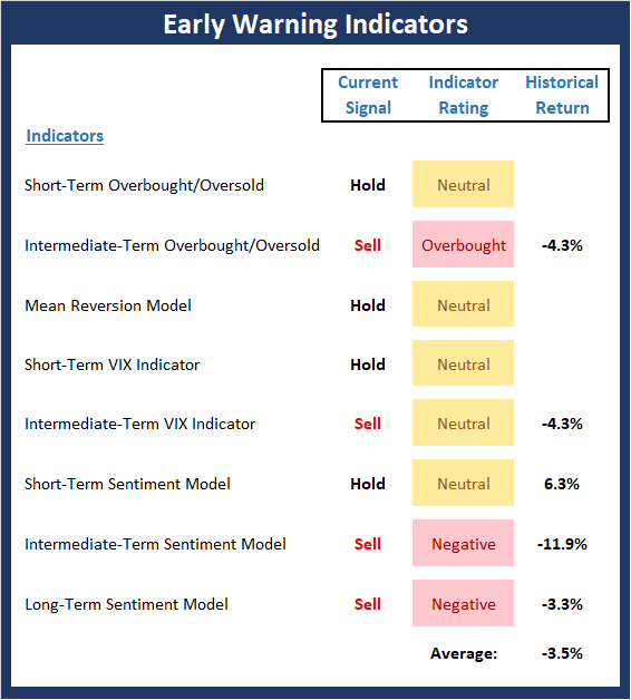
View Early Warning Indicator Board Online
The Bottom Line:
- The Early Warning board did a nice job warning us that the table had been set for the bears. As such last week's pullback should not have come as a surprise. And as we've been saying, the fact that the trend and momentum boards had been so strong recently, the argument can be made that any near-term downside should be short and shallow.
The State of the Macro Picture
Now let's move on to the market's fundamental factors - the indicators designed to tell us the state of the big-picture market drivers including monetary conditions, the economy, inflation, and valuations.
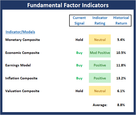
View Fundamental Indicator Board Online
The Bottom Line:
- What I wrote last week bears repeating here:
"While the Fundamental Factors board suggests the backdrop for equities remains constructive, it is worth noting that some of our economic models have slipped recently. For example our model designed to predict economic growth fell into the "moderate growth" mode and our model using the index of Coincident Economic Indicators produced a sell signal. So, while the bulls should be given the benefit of any doubt from near-term perspective, we need to recognize that the #GrowthSlowing theme is real."
The bottom line is that from my seat, other than a trade deal crumbling, #GrowthSlowing presents the biggest risk to the bull case going forward. P.S. No trade deal would put more pressure - perhaps a lot more pressure - on the growth outlook for global growth and in turn, earnings.
Thought For The Day:
Twenty years from now you will be more disappointed by the things you didn't do, than the ones you did. - Mark Twain
Wishing you green screens and all the best for a great day,

David D. Moenning
Founder, Chief Investment Officer
Heritage Capital Research
HCR Focuses on a Risk-Managed Approach to Investing
What Risk Management Can and Cannot Do

HCR Awarded Top Honors in 2018 NAAIM Shark Tank Portfolio Strategy Competition
Each year, NAAIM (National Association of Active Investment Managers) hosts a competition to identify the best actively managed investment strategies. In April, HCR's Dave Moenning took home first place for his flagship risk management strategy.
<hr>Disclosures
At the time of publication, Mr. Moenning held long positions in the following securities mentioned: None - Note that positions may change at any time.
Leading Indicators Model: A group of indicators that have historically shown tendencies to lead the market at major turning points.
The State of the Market Model: Designed to provide a composite reading for the technical health of the broad equity market. A diffusion indicator based on the status of more than 100 component indicators.
Risk/Reward Model: A model-of-models intended to provide an overall view of the state of the risk/reward environment. The model includes tape, monetary, and sentiment indicators as well as 7 big-picture market model readings.
Desert Island Model: If I was stranded on a desert island with access to only one market model to manage money with, this would be the model. The model is a comprehensive model-of-models comprised of trend, momentum, mean reversion, economic, monetary, sentiment, and factor-based indicators/models.
External Factors Model: A model-of-models designed to provide a reading on the "macro state" of the market environment. The model is comprised of indicators/models in the areas of various index yields, industrial production, investors sentiment, and historic volatility.
Short-Term Trend-and-Breadth Signal Explained: History shows the most reliable market moves tend to occur when the breadth indices are in gear with the major market averages. When the breadth measures diverge, investors should take note that a trend reversal may be at hand. This indicator incorporates NDR's All-Cap Dollar Weighted Equity Series and A/D Line. From 1998, when the A/D line is above its 5-day smoothing and the All-Cap Equal Weighted Equity Series is above its 25-day smoothing, the equity index has gained at a rate of +32.5% per year. When one of the indicators is above its smoothing, the equity index has gained at a rate of +13.3% per year. And when both are below, the equity index has lost +23.6% per year.
Channel Breakout System Explained: The short-term and intermediate-term Channel Breakout Systems are modified versions of the Donchian Channel indicator. According to Wikipedia, "The Donchian channel is an indicator used in market trading developed by Richard Donchian. It is formed by taking the highest high and the lowest low of the last n periods. The area between the high and the low is the channel for the period chosen."
Intermediate-Term Trend-and-Breadth Signal Explained: This indicator incorporates NDR's All-Cap Dollar Weighted Equity Series and A/D Line. From 1998, when the A/D line is above its 45-day smoothing and the All-Cap Equal Weighted Equity Series is above its 45-day smoothing, the equity index has gained at a rate of +17.6% per year. When one of the indicators is above its smoothing, the equity index has gained at a rate of +6.5% per year. And when both are below, the equity index has lost -1.3% per year.
Cycle Composite Projections: The cycle composite combines the 1-year Seasonal, 4-year Presidential, and 10-year Decennial cycles. The indicator reading shown uses the cycle projection for the upcoming week.
Trading Mode Indicator: This indicator attempts to identify whether the current trading environment is "trending" or "mean reverting." The indicator takes the composite reading of the Efficiency Ratio, the Average Correlation Coefficient, and Trend Strength models.
Volume Relationship Models: These models review the relationship between "supply" and "demand" volume over the short- and intermediate-term time frames.
Price Thrust Model Explained: This indicator measures the 3-day rate of change of the Value Line Composite relative to the standard deviation of the 30-day average. When the Value Line's 3-day rate of change have moved above 0.5 standard deviation of the 30-day average ROC, a "thrust" occurs and since 2000, the Value Line Composite has gained ground at a rate of +20.6% per year. When the indicator is below 0.5 standard deviation of the 30-day, the Value Line has lost ground at a rate of -10.0% per year. And when neutral, the Value Line has gained at a rate of +5.9% per year.
Volume Thrust Model Explained: This indicator uses NASDAQ volume data to indicate bullish and bearish conditions for the NASDAQ Composite Index. The indicator plots the ratio of the 10-day total of NASDAQ daily advancing volume (i.e., the total volume traded in stocks which rose in price each day) to the 10-day total of daily declining volume (volume traded in stocks which fell each day). This ratio indicates when advancing stocks are attracting the majority of the volume (readings above 1.0) and when declining stocks are seeing the heaviest trading (readings below 1.0). This indicator thus supports the case that a rising market supported by heavier volume in the advancing issues tends to be the most bullish condition, while a declining market with downside volume dominating confirms bearish conditions. When in a positive mode, the NASDAQ Composite has gained at a rate of +38.3% per year, When neutral, the NASDAQ has gained at a rate of +13.3% per year. And when negative, the NASDAQ has lost at a rate of -13.99% per year.
Breadth Thrust Model Explained: This indicator uses the number of NASDAQ-listed stocks advancing and declining to indicate bullish or bearish breadth conditions for the NASDAQ Composite. The indicator plots the ratio of the 10-day total of the number of stocks rising on the NASDAQ each day to the 10-day total of the number of stocks declining each day. Using 10-day totals smooths the random daily fluctuations and gives indications on an intermediate-term basis. As expected, the NASDAQ Composite performs much better when the 10-day A/D ratio is high (strong breadth) and worse when the indicator is in its lower mode (weak breadth). The most bullish conditions for the NASDAQ when the 10-day A/D indicator is not only high, but has recently posted an extreme high reading and thus indicated a thrust of upside momentum. Bearish conditions are confirmed when the indicator is low and has recently signaled a downside breadth thrust. In positive mode, the NASDAQ has gained at a rate of +22.1% per year since 1981. In a neutral mode, the NASDAQ has gained at a rate of +14.5% per year. And when in a negative mode, the NASDAQ has lost at a rate of -6.4% per year.
Short-Term Overbought/sold Indicator: This indicator is the current reading of the 14,1,3 stochastic oscillator. When the oscillator is above 80 and the %K is above the %D, the indicator gives an overbought reading. Conversely, when the oscillator is below 20 and %K is below its %D, the indicator is oversold.
Intermediate-Term Overbought/sold Indicator: This indicator is a 40-day RSI reading. When above 57.5, the indicator is considered overbought and wnen below 45 it is oversold.
Mean Reversion Model: This is a diffusion model consisting of five indicators that can produce buy and sell signals based on overbought/sold conditions.
VIX Indicator: This indicators looks at the current reading of the VIX relative to standard deviation bands. When the indicator reaches an extreme reading in either direction, it is an indication that a market trend could reverse in the near-term.
Short-Term Sentiment Indicator: This is a model-of-models composed of 18 independent sentiment indicators designed to indicate when market sentiment has reached an extreme from a short-term perspective. Historical analysis indicates that the stock market's best gains come after an environment has become extremely negative from a sentiment standpoint. Conversely, when sentiment becomes extremely positive, market returns have been subpar.
Intermediate-Term Sentiment Indicator: This is a model-of-models composed of 7 independent sentiment indicators designed to indicate when market sentiment has reached an extreme from a intrmediate-term perspective. Historical analysis indicates that the stock market's best gains come after an environment has become extremely negative from a sentiment standpoint. Conversely, when sentiment becomes extremely positive, market returns have been subpar.
Long-Term Sentiment Indicator: This is a model-of-models composed of 6 independent sentiment indicators designed to indicate when market sentiment has reached an extreme from a long-term perspective. Historical analysis indicates that the stock market's best gains come after an environment has become extremely negative from a sentiment standpoint. Conversely, when sentiment becomes extremely positive, market returns have been subpar.
Absolute Monetary Model Explained: The popular cliche, "Don't fight the Fed" is really a testament to the profound impact that interest rates and Fed policy have on the market. It is a proven fact that monetary conditions are one of the most powerful influences on the direction of stock prices. The Absolute Monetary Model looks at the current level of interest rates relative to historical levels and Fed policy.
Relative Monetary Model Explained: The "relative" monetary model looks at monetary indicators relative to recent levels as well as rates of change and Fed Policy.
Economic Model Explained: During the middle of bull and bear markets, understanding the overall health of the economy and how it impacts the stock market is one of the few truly logical aspects of the stock market. When our Economic model sports a "positive" reading, history (beginning in 1965) shows that stocks enjoy returns in excess of 21% per year. Yet, when the model's reading falls into the "negative" zone, the S&P has lost nearly -25% per year. However, it is vital to understand that there are times when good economic news is actually bad for stocks and vice versa. Thus, the Economic model can help investors stay in tune with where we are in the overall economic cycle.
Inflation Model Explained: They say that "the tape tells all." However, one of the best "big picture" indicators of what the market is expected to do next is inflation. Simply put, since 1962, when the model indicates that inflationary pressures are strong, stocks have lost ground. Yet, when inflationary pressures are low, the S&P 500 has gained ground at a rate in excess of 13%. The bottom line is inflation is one of the primary drivers of stock market returns.
Valuation Model Explained: If you want to get analysts really riled up, you need only to begin a discussion of market valuation. While the question of whether stocks are overvalued or undervalued appears to be a simple one, the subject is actually extremely complex. To simplify the subject dramatically, investors must first determine if they should focus on relative valuation (which include the current level of interest rates) or absolute valuation measures (the more traditional readings of Price/Earnings, Price/Dividend, and Price/Book Value). We believe that it is important to recognize that environments change. And as such, the market's focus and corresponding view of valuations are likely to change as well. Thus, we depend on our Valuation Models to help us keep our eye on the ball.
<hr>Disclosures
The opinions and forecasts expressed herein are those of Mr. David Moenning and may not actually come to pass. Mr. Moenning's opinions and viewpoints regarding the future of the markets should not be construed as recommendations. The analysis and information in this report is for informational purposes only. No part of the material presented in this report is intended as an investment recommendation or investment advice. Neither the information nor any opinion expressed constitutes a solicitation to purchase or sell securities or any investment program.
Any investment decisions must in all cases be made by the reader or by his or her investment adviser. Do NOT ever purchase any security without doing sufficient research. There is no guarantee that the investment objectives outlined will actually come to pass. All opinions expressed herein are subject to change without notice. Neither the editor, employees, nor any of their affiliates shall have any liability for any loss sustained by anyone who has relied on the information provided.
Mr. Moenning may at times have positions in the securities referred to and may make purchases or sales of these securities while publications are in circulation. Positions may change at any time.
The analysis provided is based on both technical and fundamental research and is provided "as is" without warranty of any kind, either expressed or implied. Although the information contained is derived from sources which are believed to be reliable, they cannot be guaranteed.
Investments in equities carry an inherent element of risk including the potential for significant loss of principal. Past performance is not an indication of future results.
Recent free content from FrontRange Trading Co.
-
 Is The Bull Argument Too Easy These Days?
— 8/31/20
Is The Bull Argument Too Easy These Days?
— 8/31/20
-
What Do The Cycles Say About 2020?
— 1/21/20
-
Modeling 2020 Expectations (Just For Fun)
— 1/13/20
-
Tips From Real-World Wendy Rhoades
— 5/06/19
-
The Best Recession Ever!
— 4/29/19
